Modern ATS Templates
The Modern Resume Template That Doesn't Break the Parse
Modern and ATS-safe get treated like opposites. They are not. A resume can look current and still read line for line, as long as the look comes from type and spacing instead of graphics. Five that pull it off are below, plus a way to audit any other you find.
Key Takeaways
A modern ATS resume template has a current, polished look and still parses cleanly, because the style comes from typography and spacing, not from sidebars or graphics.
Modern and ATS-safe are not opposites. The common belief that an ATS resume has to look plain is a false trade-off, and it is what pushes people toward templates that break.
Many templates sold as modern and ATS-friendly are not. A two-column Canva or Etsy layout with a photo and skill bars looks impressive and comes apart in the parser.
A modern template removes the parsing penalty. It does not guarantee a pass. Run the finished file through the free checker before you apply.
- Resumes Analyzed
- 50K+
- Average ATS Score Increase
- 25%
- ATS Checks Per Full Report
- 30+
- From Upload to ATS Score
- <60s
What Is a Modern ATS Resume Template?
It is a template with a current, polished look that still parses cleanly: one column of real text and standard headings, where the modern feel comes from typography and spacing rather than graphics.
That last part is the whole reframe. People treat modern and ATS-safe as a trade-off, as if a resume that reads well to software has to look dated. It does not.
Modern is a decision about type, size, and whitespace, and every one of those survives a parser. A sidebar and a photo are what break it, and you never needed them to look current. See the same idea in its full ATS resume format guide, then pick a template below.
Modern ATS Templates
Five Modern Layouts That Stay Single-Column
Each one is filled with the same real resume so you can see the look, not a blank frame. They differ in type, spacing, and header treatment, and every one is a single column of selectable text that reads cleanly in Workday, Greenhouse, Lever, Taleo, and iCIMS. Pick the feel you want.
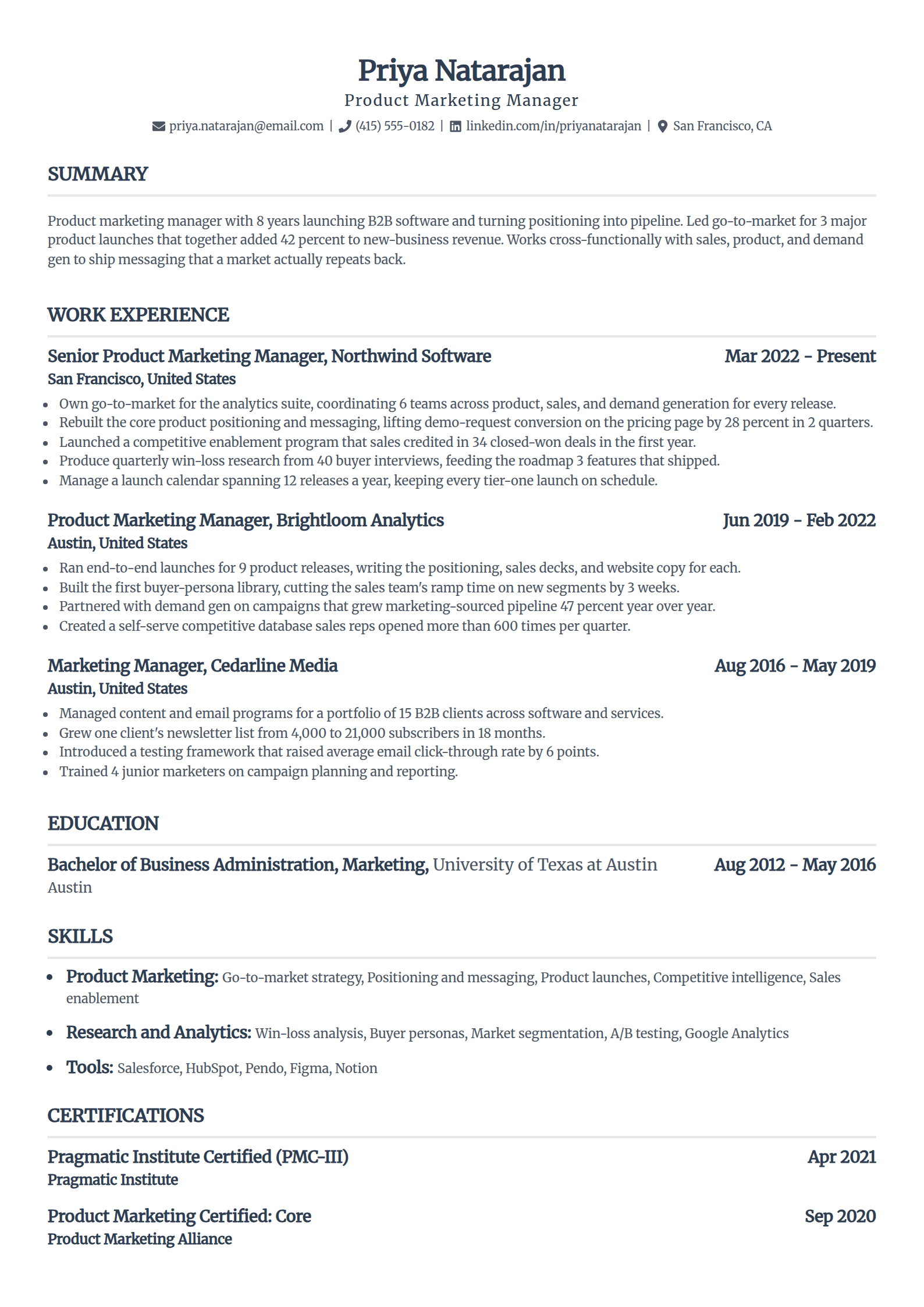
Standard
A centered name and right-aligned dates give it a current, balanced feel while the bones stay conventional enough for any parser.
Use the Standard template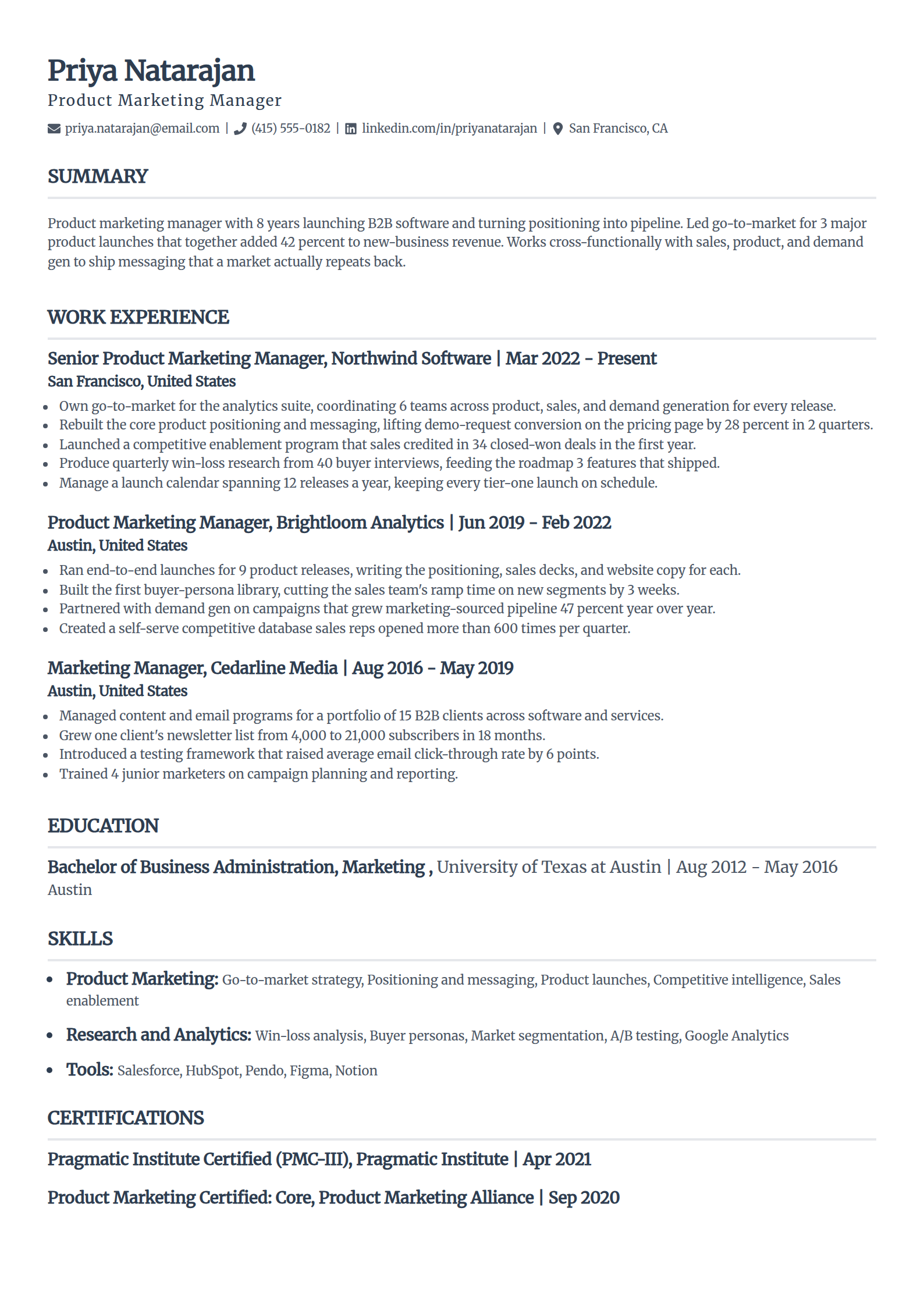
Classic
The single-column standard with generous spacing and clean rules. It reads as up to date without a single graphic on the page.
Use the Classic template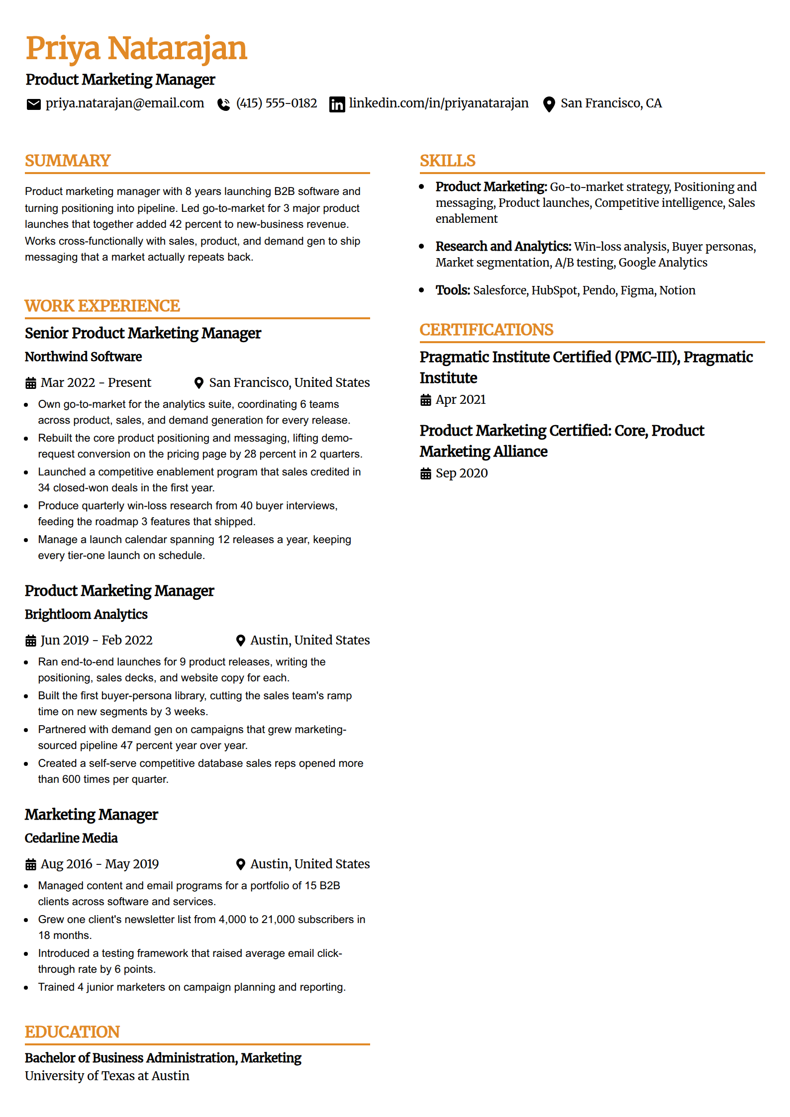
Professional Edge
A confident header and firm section breaks give it a contemporary look, and every block underneath is still a plain text field.
Use the Professional Edge template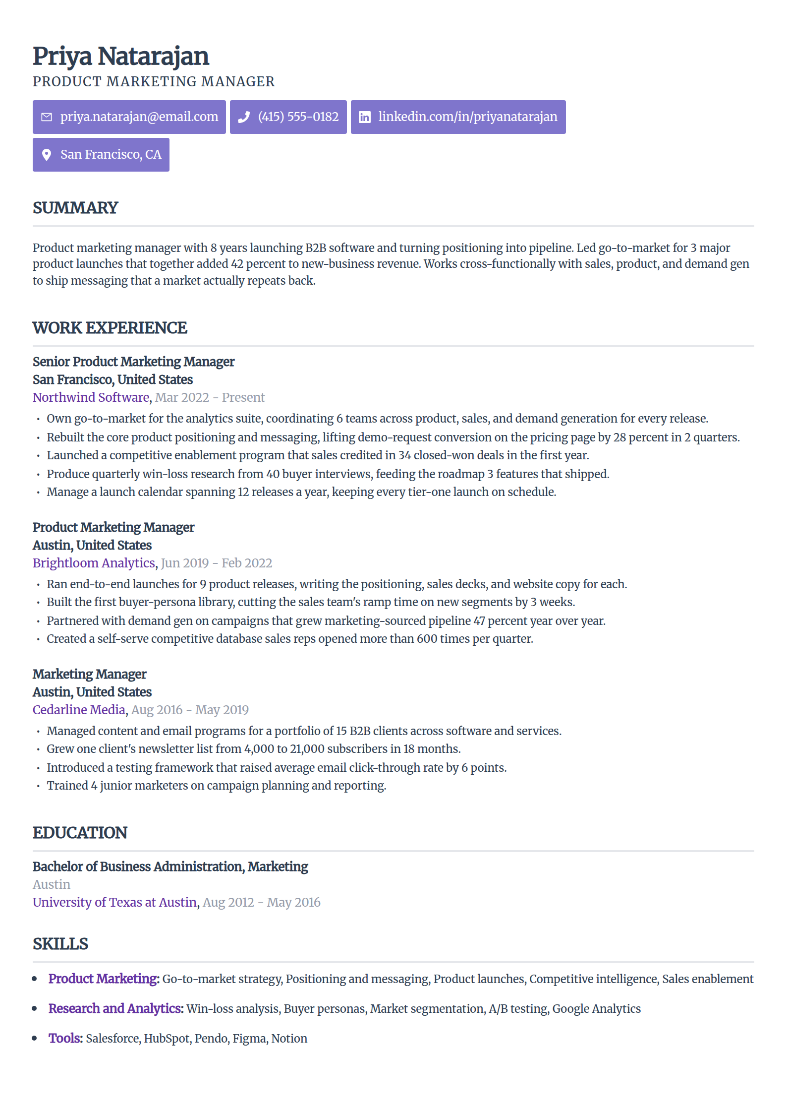
Sleek Framework
The most design-forward look here: tight typography and disciplined whitespace, all of it one column of real, selectable text.
Use the Sleek Framework template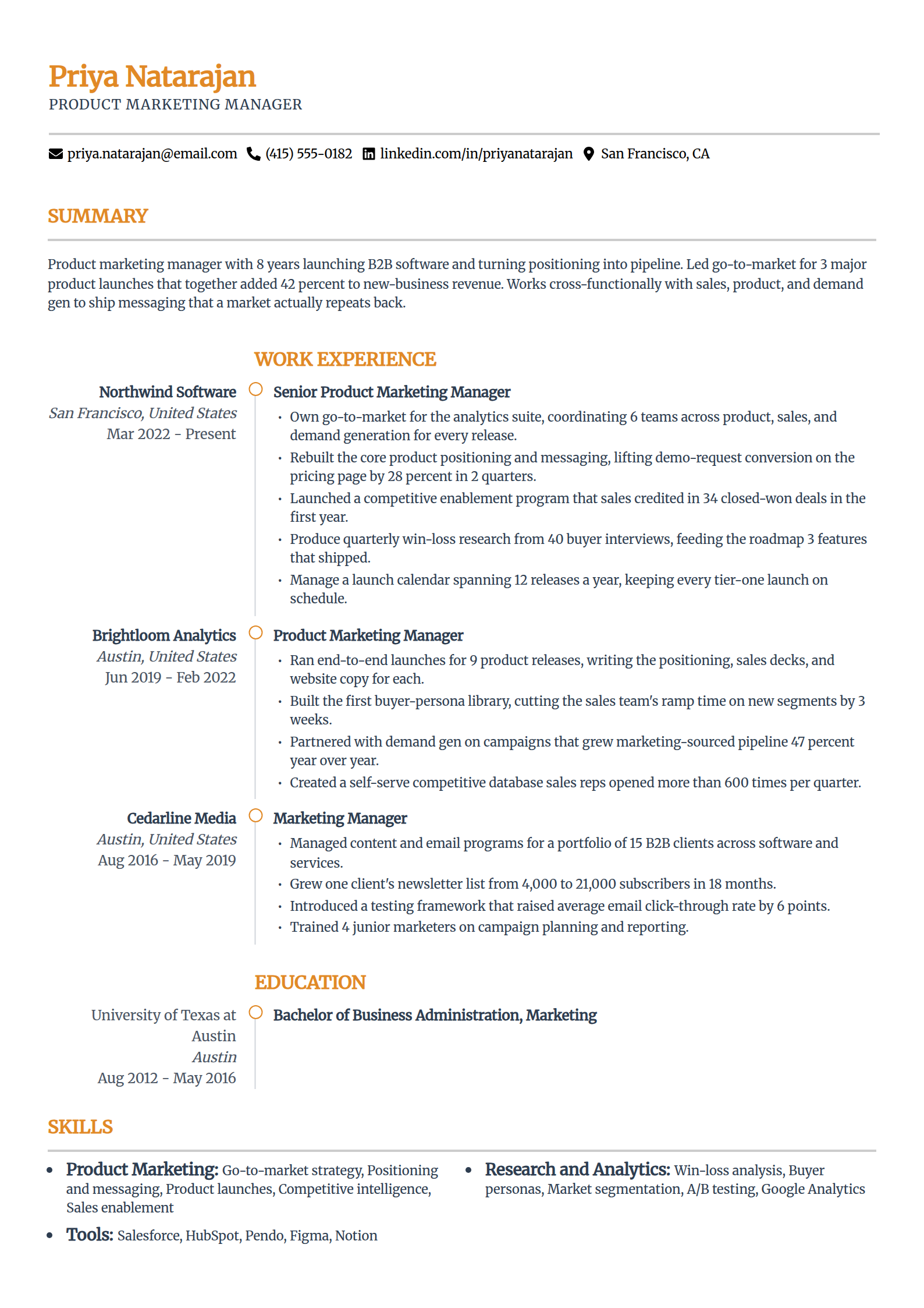
Zenith
An airy hierarchy that leads with your summary. Modern spacing does the work a sidebar usually does, with nothing for a parser to trip on.
Use the Zenith templateEvery template here is free to fill and export as a text-based PDF or DOCX, with nothing to pay at download. The AI writing help and premium designs sit inside the paid builder plans; using and exporting these modern layouts costs you nothing at all.
Modern Is Type and Space, Not Graphics
The look people call modern almost always comes from restraint, not decoration. Here is what actually reads as current and still parses, next to what only looks the part and breaks.
Modern, and it parses
- Confident typography and a clear size hierarchy, so the page looks designed without any graphics.
- Generous whitespace and consistent spacing doing the work a sidebar or color block usually does.
- One column of real, selectable text a parser reads top to bottom in the order you wrote it.
- Standard headings and plain bullets, styled with spacing rather than icons or bars.
Looks modern, breaks the parse
- A left or right sidebar for skills and contact, which a parser reads across and splices into your job history.
- A photo, logo, or monogram, all of which read back to the software as nothing.
- Skill rating bars, icons, and infographics that carry meaning no parser can extract.
- Contact details in the file's header strip, where they often never reach the contact fields.
This is why a two-column layout fails even when it looks the most designed. The parser reads across both columns and splices your sidebar into your job history. The full breakdown lives in one column versus two for ATS.
How to Tell a Safe Modern Template From a Risky One
A template being sold as modern and ATS-friendly does not make it either. Six checks separate a genuinely safe layout from a designed-but-risky one. Hold any download against them first.
One column, nothing beside it
The whole page is a single stack. The moment a template puts skills or contact in a side rail, the parser reads left to right across both and scrambles the order.
The highlight test passes
Open the file and drag your cursor across it. Anything that will not select, a name, a heading, an icon, went in as a picture, and a picture reads back as blank.
Style comes from type and space
The modern feel should trace to fonts, sizing, and whitespace. If it traces to color blocks, graphics, or a two-column grid, the look is fighting the parse.
Ordinary heading words
Summary, Experience, Education, Skills. A modern template can style them, but it should not rename them to something clever the software will not recognize.
Contact line inside the body
Email, phone, and city sit in the first lines of the page, not in the document header, so they land in the fields a recruiter searches.
Exports as text, not an image
Save a text-based PDF or DOCX that keeps every word selectable. A design tool that exports a picture of the page hands the parser an empty sheet.
For the full set of single-column templates with a per-template breakdown of who each one fits, see the ATS resume templates hub, and for the plainest version of the same idea, the simple ATS template guide.
Free ATS Resume Checker
A Good-Looking Page Is Not a Tested One
The screen shows you the design. It cannot show you what the parser does with it. Upload the file for a 0-100 score and the 30-plus checks behind it in under 60 seconds, and read back exactly what the software pulled off the page.
Who a Modern Template Fits Best
A modern layout suits anyone who wants a current, polished page without gambling their parse on a design gimmick. It is the middle ground between a stark template and a risky designed one.
Mid-career professionals
A current, polished layout signals you keep up without gambling your parse on a design gimmick. The content carries the page; the styling just frames it.
Marketing, product, and tech roles
Fields where a dated resume stands out for the wrong reason. A clean modern template reads as current while staying safe in the portal.
Anyone who finds plain templates too stark
If a bare template feels like too little, a modern one gives you hierarchy and polish without adding the graphics that break parsing.
Applicants going through a portal
When you cannot see the parser behind the upload, a modern single-column layout gives you the look you want with the least for the software to misread.
Whichever template you choose, the layout gets you read and your wording decides your rank. The free keyword scanner shows the exact terms a posting wants before you apply.
Does a Modern Template Guarantee It Passes?
No. A modern single-column template clears the formatting penalty. It does not decide whether you fit the job, and it is worth saying so where most template pages let you assume the opposite.
An applicant tracking system almost never bins a resume for its layout. It parses what it can and ranks you, and a page it struggles to read simply ranks lower, where a recruiter does not scroll.
That ranking is what most employers lean on to make a first cut. In Harvard Business School's Hidden Workers study with Accenture in 2021, more than 90 percent of surveyed employers using this software relied on it to filter or rank applicants.
A template that parses keeps you in that ranking instead of buried under it.
So pick the modern look you like to remove the penalty. Then win on the two things that move your rank: keywords that match the exact posting, and real detail that fits the role.
The template gets you read. Your content gets you shortlisted.
Why Trust This
A Beautiful Resume That Broke
The best-looking resume I ever failed to open properly was a designer's. A two-column template with a slim skills sidebar and a headshot, genuinely beautiful on screen.
Inside our applicant tracking system it arrived with the sidebar spliced through the job history and the photo gone, and a strong candidate read as a mess. A modern single-column version of the same resume came through perfectly.
Modern was never the problem. The second column was, and the six checks on this page are what I look for before trusting any template that calls itself modern.
Who wrote this
Rohith Reddy Jarugu, builder of ats resume checker. Ten years in software hiring, 500+ interviews conducted, now building career tools full time. LinkedIn
The Look Is Yours. The Proof Is a Test.
A modern layout clears the parsing traps and stops there. Whether your export held, your keywords match, and the software reads every line is on you to confirm. It takes a minute, no signup.
ATS Resume Checker
Upload the finished resume for a 0-100 score and a 30+ check report in under 60 seconds. The one thing a good-looking template cannot confirm for you.
Check my resumeATS Resume Parser
See the raw text a parser pulls from your file, section by section, so you catch anything a modern layout dropped before it costs you.
Preview the parseResume Keyword Scanner
Paste a posting and your resume to see the exact terms you are missing, so your wording matches the job you want.
Scan for keywordsATS Resume Templates Hub
The full set of single-column templates with a per-template breakdown of who each one fits and exactly why it parses cleanly.
See the full hubFree ATS Resume Checker
Make Sure the Design Survived the Upload
A current look gets you most of the way. The free checker reads the finished file the way an ATS does and shows the 30-plus checks behind your score, in under 60 seconds.
Modern ATS Resume Template: FAQs
The questions people ask before trusting a modern-looking template with a real application. Still stuck? Contact us and we'll help.
What is a modern ATS resume template?
It is a resume template with a current, polished look that still parses cleanly, meaning one column of real text, standard headings, and web-safe fonts, with the modern feel coming from typography and spacing rather than graphics. The key point is that modern is a design choice about type and whitespace, not about sidebars, photos, or color blocks. A template can look up to date and still be single-column and ATS-safe.
Are modern resume templates ATS-friendly?
Some are and many are not, so the label alone is not a guarantee. A modern template that stays single-column with real text and standard headings is ATS-friendly. A modern template that uses a sidebar, a photo, skill bars, or a two-column grid is not, because the parser reads across the columns and drops the graphics, no matter how professional it looks. Judge the layout, not the word modern.
Does a modern template mean my resume looks like everyone else's?
No. A single-column layout is a structure, not a style. Within it, the font, the spacing, the hierarchy, and the header treatment give each template a distinct, current feel, which is why the five in the gallery above look clearly different from one another. You get a modern, individual look while keeping the one thing every ATS needs, which is a clean single column of real text.
Why do so many modern templates fail ATS scans?
Because modern is often used to mean designed, and designed usually means two columns, a sidebar, and graphics. Those are the exact elements a parser struggles with: it reads a two-column page across both columns, splicing a skill into the middle of a job, and it drops photos, icons, and rating bars entirely. The template looks impressive on screen and comes apart the moment the software reads it.
What font should a modern ATS resume use?
Use a clean, common font at 10 to 12 point: Calibri, Arial, Helvetica, or Georgia all read as modern and parse everywhere. Web-safe is the requirement, since an unusual font can render as boxes or fail to embed. The modern feel comes from how you use the type, with clear sizing and generous spacing, not from an exotic typeface. Keep the file a text-based PDF or DOCX so every word stays selectable.
Does a modern template guarantee my resume passes the ATS?
No, and treat any template that promises it with suspicion. A modern single-column template removes the formatting traps that break parsing, so you get read and fairly ranked. Reaching a recruiter still depends on your keywords matching the posting and your experience fitting the role. An applicant tracking system ranks and filters; it rarely auto-rejects on layout. The template lifts the parsing penalty, and testing the finished file is what proves it.
Keep Reading
Free ATS Resume Templates: The Ones Worth Using
Free single-column templates that parse cleanly, an element-by-element safe-vs-risky checklist, and how to spot a fake ATS-friendly template before you build on it.
Read the guideSimple ATS Resume Template That Parses Clean
Minimalist single-column templates that read line for line, the difference between deliberately simple and just basic, who a minimal layout fits best, and how to fill one without clutter.
Read the guide